Making a brand tension map
I’m taking an amazingly thought-provoking class at SVA called “The Feeling of Design,” taught by Sue Walsh. One of our assignments is “Design for a Cure,” in which we identify a social campaign and think critically about the tension between the issue itself (cancer, heart disease, diabetes, etc) and what its campaign branding communicates about the issue.
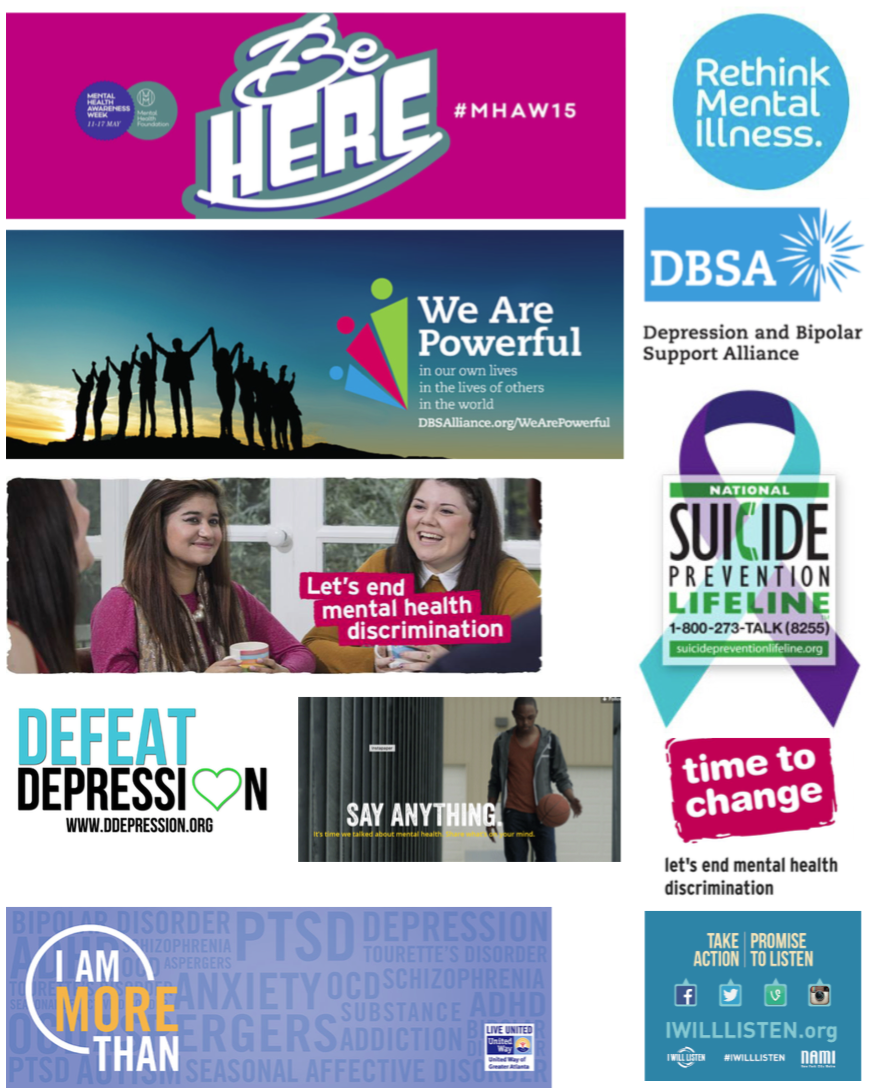
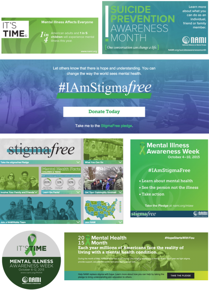
I choose mental health, since it's something I feel passionate about. Very quickly, I got lost in a research rabbit hole. But the look and feel of the examples campaigns I found made me feel distant and, if anything, viscerally disengaged...
Moodboard - Mental health campaign design
The Brand Tension Map
It was a lot of stuff to wade through. Whenever I feel a bit overwhelmed, my natural tendency is to organize like crazy— lists, diagrams, pie charts, dish-washing, you name it (this is why I became an organizational coach).
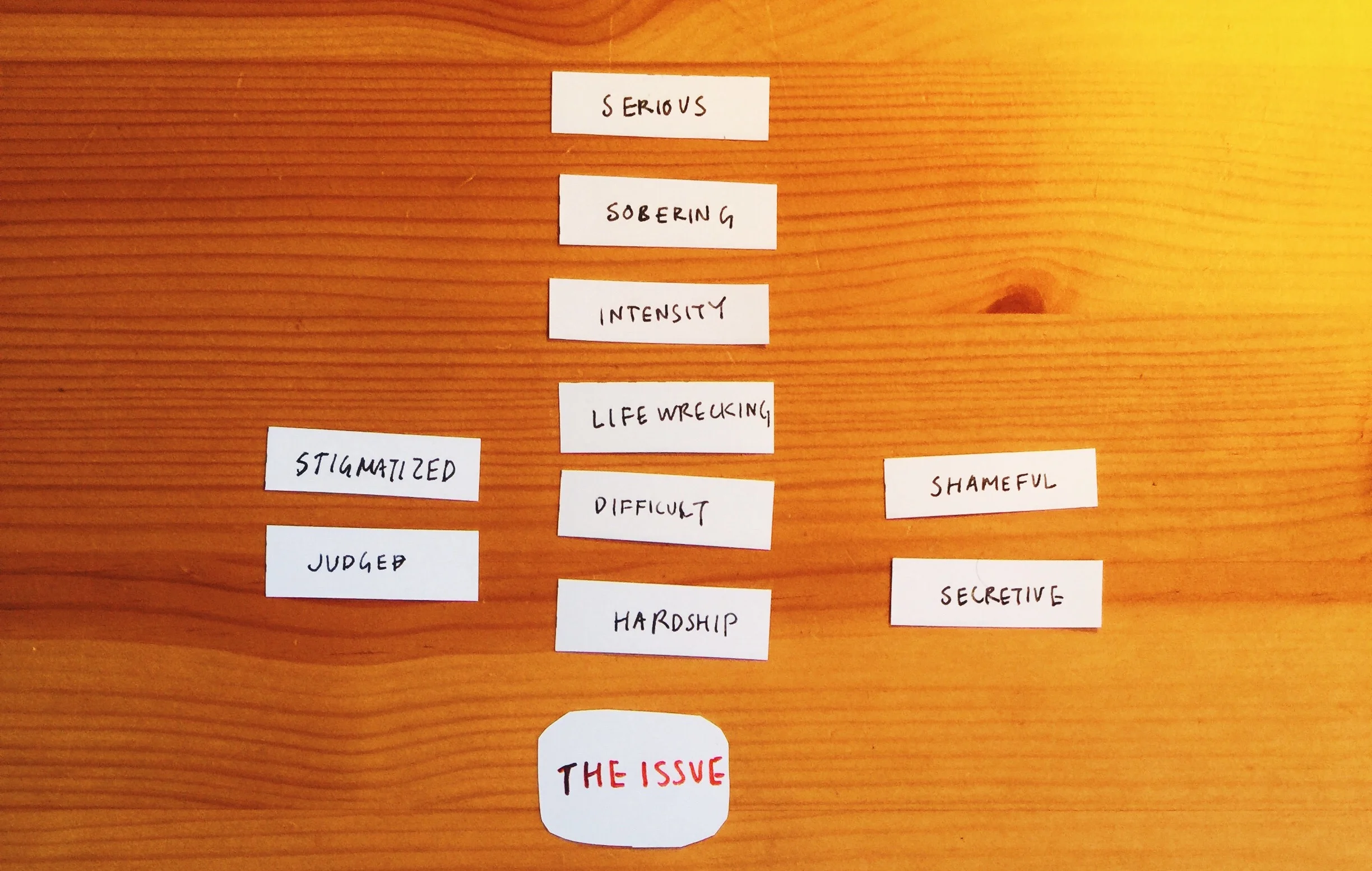
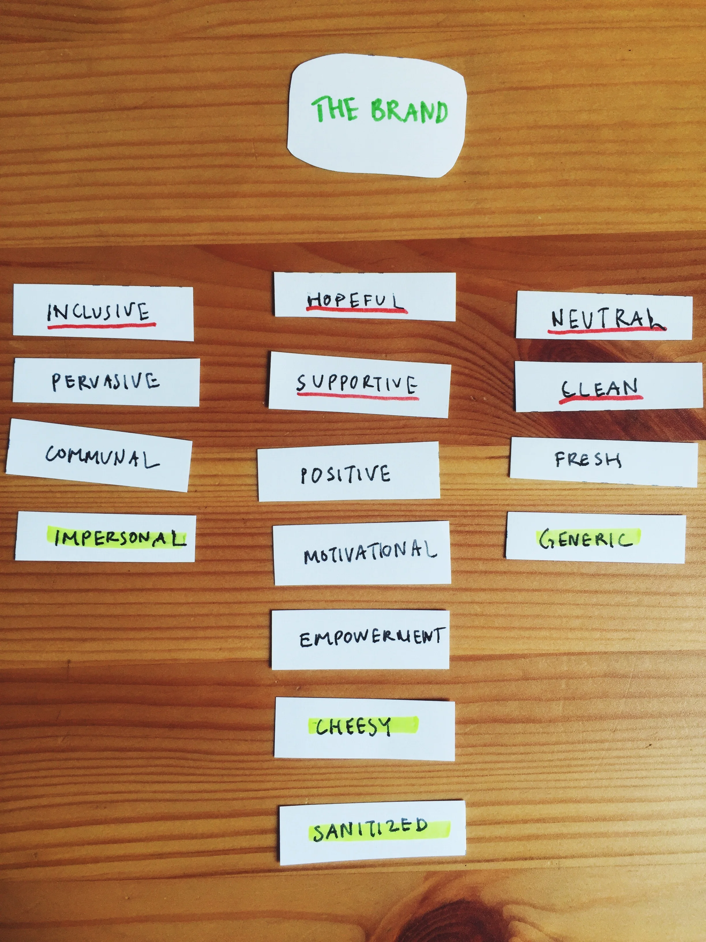
I made this brand tension map to help me wrap my head around the issue.
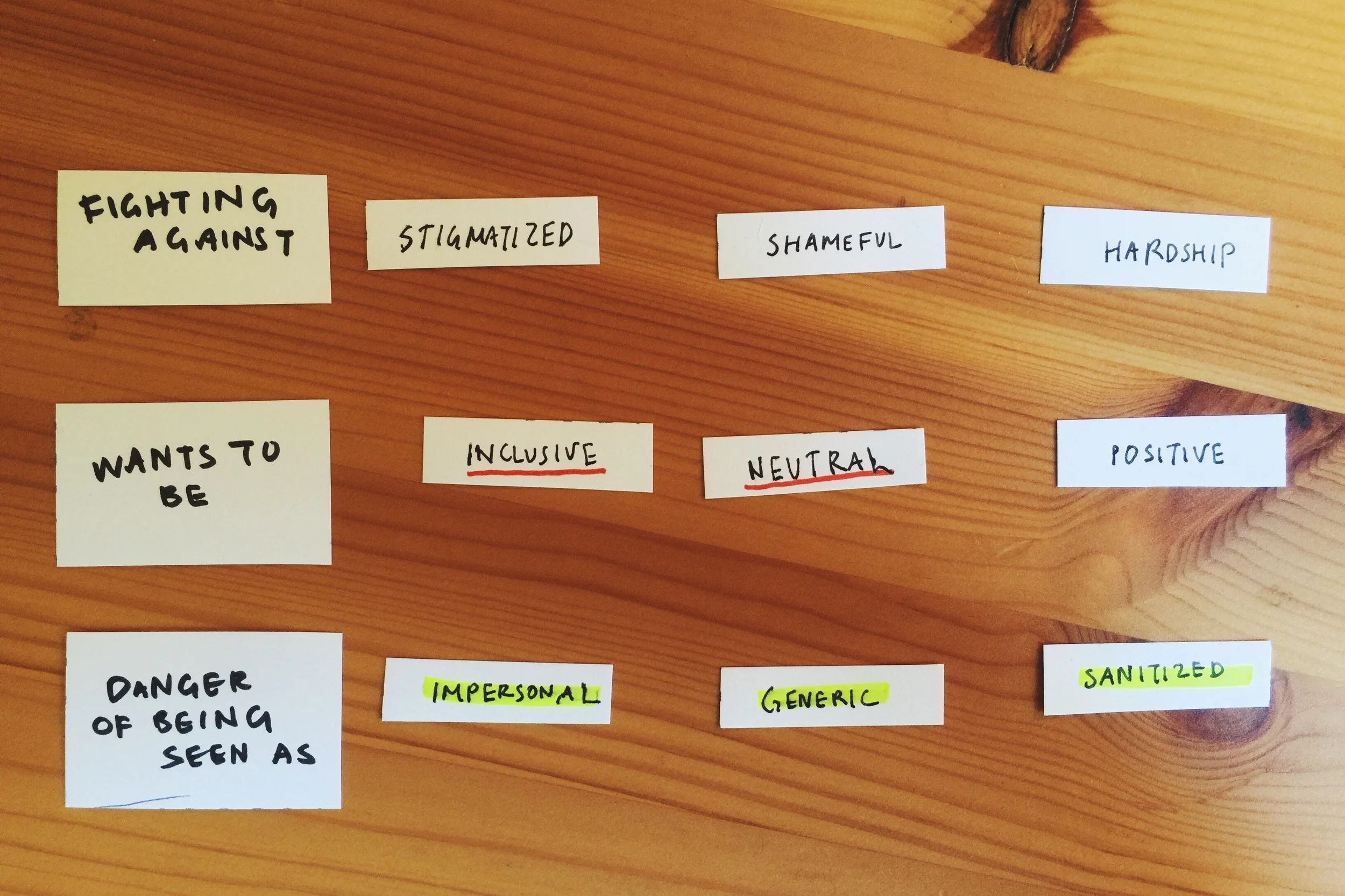
A summary of my diagram:
The issue - describes how our culture thinks about mental health and mental illness, specifically.
The brand - describes a specific campaign I looked at (NAMI’s mental health awareness month).
Danger of feeling - are adjectives that the brand may start to unintentionally veer into.
Is not enough, or “diagnosis” - this is my diagnosis of what the brand or genre needs in its redesign, in order to find a meaningful balance between the issue (mental health) and the brand.
Columns of words - I categorized each word cluster as sliding parts of a spectrum (from what the brand is fighting against, to what it’s in danger of feeling).
The Process
This was my first stab at a brand tension map, so I'll probably refine this process over time. I'll describe what I did this first round.
Note: personally, I like writing the words down on paper slips instead of using a notebook and pen, because the tactile experience gives me more to work with. It's easier for me to think about the relationships between words, eliminate words, and think of new insights.
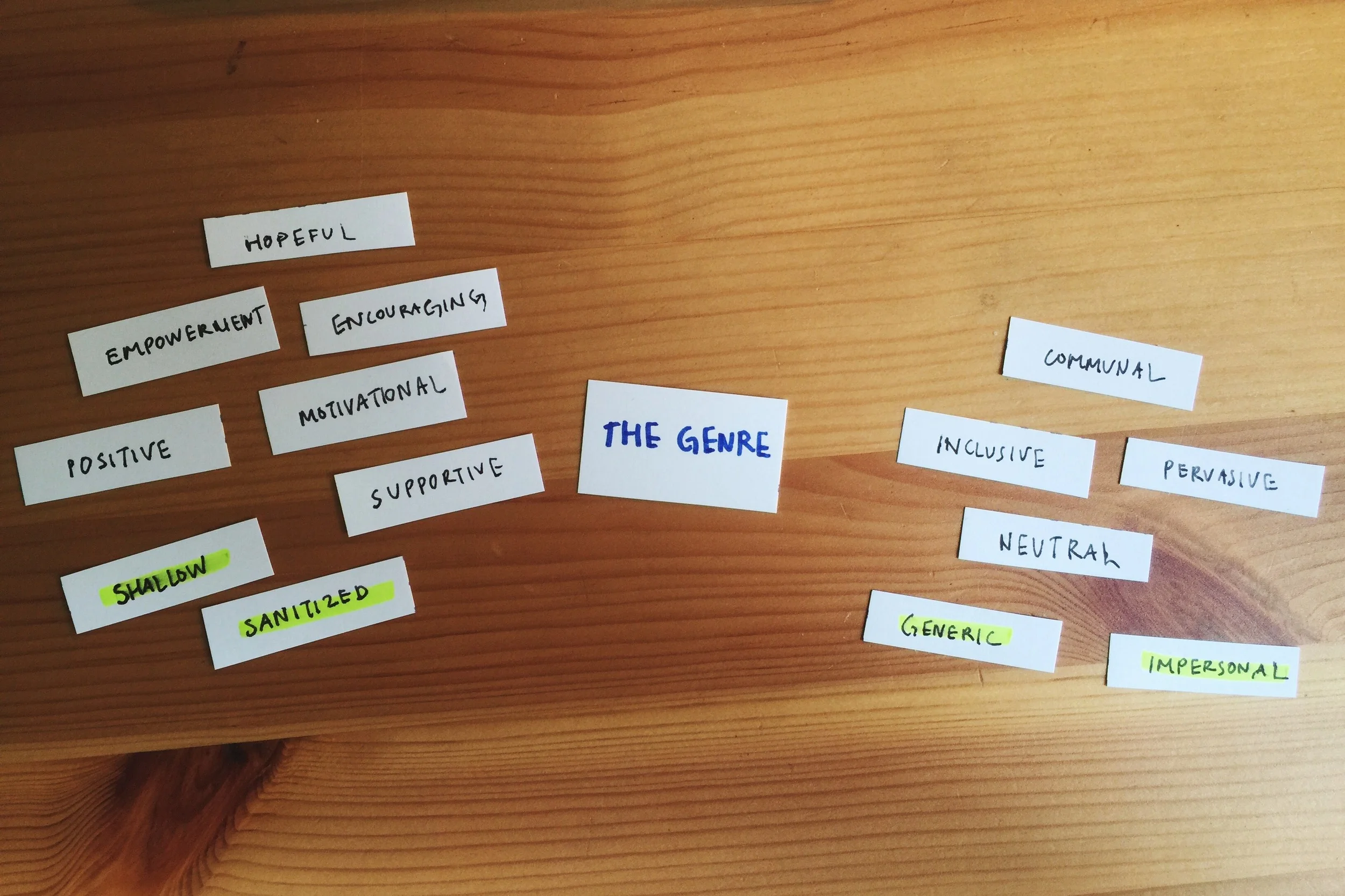
Step 1: Describe the genre.
Research and collect images of the genre. Look for patterns, themes, and evocations. How does this make you feel? Write down any and all words that describe this genre.
Step 2: Describe the brand
Look at the specific brand in context of the overall genre. How does it differ or relate? Write down words any and all words that you think of, even if it's words the brand isn't intentionally going for (mine are highlighted).
Step 3: Describe the Subject/Issue
Think about the subject of this genre and write down words you would use to describe how it's perceived in society or popular culture. What do people think of when they think of X?
Step 4: Move stuff around, cut down, and find relationships between the word groups.
See if you can identify insights, patterns, or trends. Can you cluster the words into groups of words? Or cut down on adjectives? Focus on fewer words? Some questions I asked myself:
What's a turn-off for me about the brand? (If I'm feeling a visceral repulsion... why is that?)
What is the brand intentionally communicating about itself, or what is it "in danger" of feeling?
How does the brand wish to be perceived? Why?
How does that desired perception relate to how it's currently perceived? How does it relate to the genre?
How does it relate to the subject or issue? In what ways is it aligned with the tones of the subject, and in what ways is it in tension with it?
Step 5: Uncovering your design solution. Oh, and glue it down.
For the redesign: I asked myself: what do you think are the missing ingredients, if any? A metaphor: if this were a dish you're cooking, what tones would you want to add more of, or take out?
How do you want to look different from the current brand, and what purpose will it serve for your target audience? How can you stay on subject or say something new about the subject?
Concluding thoughts
After making my brand tension map, my main insight is that the mental health nonprofit genre tends to be overly motivational/positive as a REACTION towards how mental health is stigmatized in our culture. My design solution is create a campaign that feels more human, real, and empathetic - without trying so hard to force empathy. As we discussed in class last week, sticking a photo of a third-world country child and a dreadful statistic just doesn’t work.
So, if you find yourself with an urge to cut out adjectives on paper slips and move them around, I'd love to hear how it goes, and what kinds of insights you get!